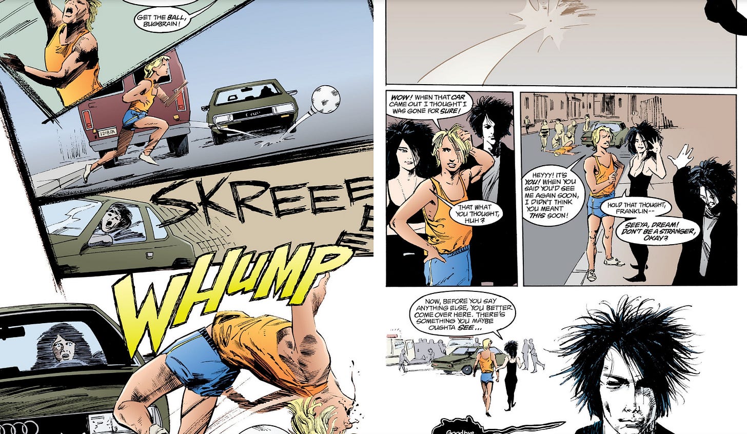
Before I got into art, I was into comics. Growing up in a rural part of Texas without access to cable TV, nevertheless Internet, I devoured whatever comics I could read while shopping with my mom at the grocery store. While the comics I read had to be given the Comics Code Authority stamp of approval, this wasn’t the case for the old issues of Wizard, which, as a magazine about comics without being a comic itself, could tell me about the wide world of heros and villains I was missing out on by being a kid. Sandman was praised a whole lot in those pages but when I was a teenager old enough to go find the back issues on my own, I wasn’t into comics so much anymore. This isn’t a story about how I got into and out of comics, though, so I’ll fast forward to the being an adult who sometimes reads both digital- and print-based comics. I want to pose one question and leave it at that:
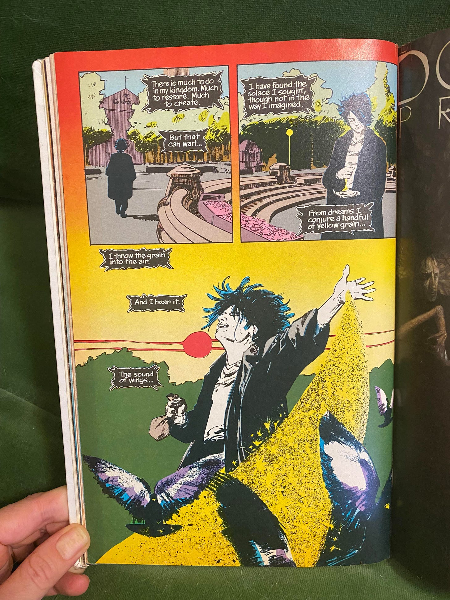
Did you know that there’s a huge difference between the digital and print editions of graphic novels, beyond color correction? The originals are so much better, especially with the shading of the pigeons’ wings in the last frame of the original (the last image included below).
(A “meh” joke for the big heads: The substitution is entirely creative, but to the extreme, like when Faust translates “In the beginning was the act” instead of “In the beginning was the word”—amirite, scholars?)


